Add an analysis
-
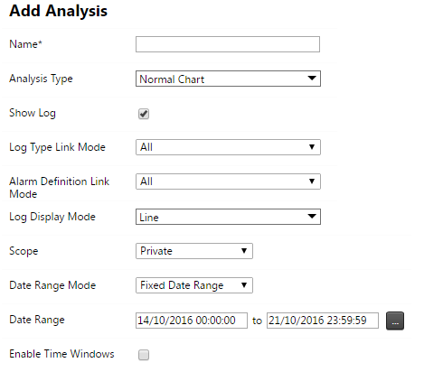
In the Analysis section, click the Add Analysis button. The Add Analysis screen appears:
-
Configure the basic analysis settings of the new analysis:
-
Name: Specify a name for the analysis. Analysis names must be unique within a project.
-
Analysis Types: Select the analysis according to the specialized charting and controls you wish to use:
-
Normal Chart: Plot analysis data on a chart surface with time denoted on the x-axis of the chart.
If you are not sure which analysis type to choose, select the Normal Chart. You can change the analysis type later, if needed.
-
Comparative Bar Chart: Compare one or more values from similar sensors visually and use a date slider to visualize changes over time.
-
Windrose: Visualize the change in wind direction and speed.
-
Tabular: Visualize observation data in a tabular format. Use a date slider to visualize changes over time.
-
Tiltmeter Array: Stack multiple tiltmeters into an array to calculate and visualize structural deflection, with the optional capability to compare deflection results against positional sensor measurements. Utilize the date slider to dynamically explore and visualize changes over time. (Also see IPI sensors and charts).
-
Heat Map: Create a geo‑referenced, interpolated image with user‑defined colors to represent specific observation values (absolute or relative). The resulting heat map is added as a selectable layer on the maps page.
-
Cross Section: Visualize a single data type component from various sensors relative to the actual distance between the sensor locations.
-
Normal Chart (Classic): Plot analysis data using the legacy charting tools, which provide additional functionality compared to the normal chart analysis, though with reduced performance.
-
High Frequency: Available only in projects with High Frequency sensors such as Accelerometers. Optimized for plotting high frequency data.
-
-
Reference Date: This date is used to determine reference measurements for series configured to display relative measurements. Note that this date is in terms of project local time.
-
Scope: You can make the analysis visible to other users by marking it as public. A private analysis can only be accessed by the user that created it.
-
Date Range Mode: The date range of an analysis can be determined either by specifying a start and an end date, or by specifying the rolling time window width.
-
Fixed date range: Use these date and time inputs to specify the analysis date range in terms or project local time.
-
Rolling Window: Specify the time window which will determine the analysis date range. The effective analysis date range will change on a continuous basis.
Window widths of less than 1 minute may be affected by data latency.
-
-
Enable Time Windows: Enable time windows if you only want to show observations in a particular time interval per day. If the To Time of Day is less than the From Time of Day then the interval wraps around midnight starting at the To Time of Day and ending on the From Time of Day of the next day. Only observations inside this daily interval will appear on the analysis chart.
-
-
Click Save.
-
Proceed to the next section to configure the analysis.
