Analysis series settings
An analysis series links the data of a sensor data value column to an analysis. The analysis then charts and offers controls to analyze the data provided by the analysis series.
To configure the analysis series for your analysis:
-
In the Normal Chart analysis you have created, click the Add button at the bottom of the Series table.
-
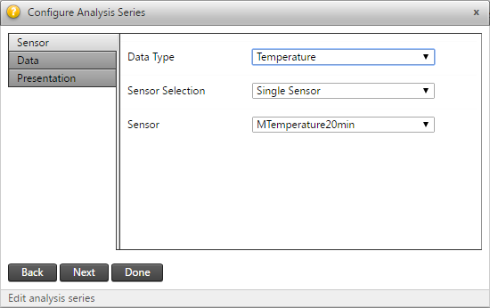
In the Configure Analysis Series window, select the Data Type of the series you wish to include in your analysis.
Notice the tabs on the left (Sensor, Data and Presentation). To navigate between the tabs click the tab labels or click the Next and Back buttons at the bottom.
-
To configure multiple analysis series to be added to your analysis:
-
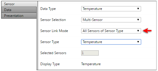
Change the Sensor Selection to Multi-Sensor.
In the Sensor Link Mode field that appears, link your analysis to specific sensors, all sensors of the selected sensor type, or all sensors of the selected sensor group.
In this example, we selected all displacement targets under Sensor Type > Target (Displacements), with 16 in total in the project.
-
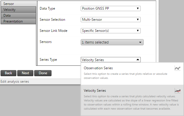
If you selected a positional data type (shown as Target (Displacement) in the example below), then you will have an additional option to select the Series Type for this analysis series. You can choose to show the analysis series as positional observations or as the velocities calculated from the positional observations.
-
Click Next to proceed to the next tab.
-
-
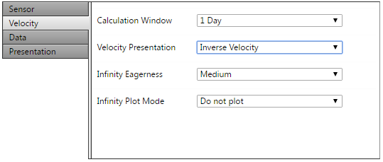
If you selected a positional data type and set the Series Type field to Velocity Series, then the Velocity tab appears.
-
Complete the following fields:
-
Calculation Window: Specify the width of the rolling time window over which a linear regression line should be fitted in order to calculate the velocity to be monitored.
-
Velocity Presentation: Specify whether the velocity should be presented as Velocity (v) or Inverse Velocity (1/v).
-
Infinity Eagerness: Applicable for Inverse Velocity. This property controls how soon infinity is assumed when a value close to zero is inverted.
-
Infinity Plot Mode: Applicable for Inverse Velocity. This property controls the manner in which infinity is plotted.
-
-
Click Next to proceed to the next tab.
-
-
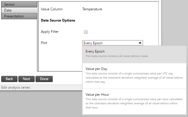
The Data tab appears.
-
Absolute/Relative: Absolute Reading displays the actual measured value. For geotech data, this could be the absolute tilt value from the tilt sensor. For displacement data, the absolute value matches the value shown in T4D Server. A Relative Reading is indicated by a small delta (∆) and depicts the change or difference between the actual reading and a chosen reference reading.
-
Column Link mode: Specify whether to create a series for a single data type component or for multiple components.
-
Value Column: Select the value column that should be plotted.
Data Source options:
-
Configure the Plot setting which determines the Summarized Data Sets (per minute, per hour etc.) to be plotted for the analysis series:
-
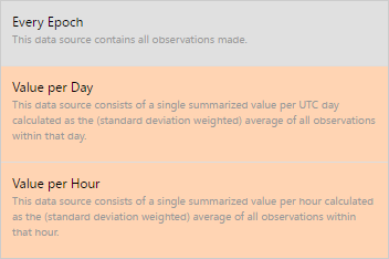
Every Epoch: Consists of all the observations received from the sensor.
-
Value per Day: Consists of a single summarized value per UTC day calculated as the (standard deviation weighted) average of all the observations within that UTC day.
-
Value per Hour: Consists of a single summarized value per hour calculated as the (standard deviation weighted) average of all the observations within that hour.
-
Value per Minute: Consists of a single summarized value per minute calculated as the (standard deviation weighted) average of all the observations within that minute. The Value per Minute summarized data set is available only for high frequency sensors.
The summarized data sets available for selection depends on the selected data Value column. If you see some summarized data sets marked with a warning color, it means that there are no observations available for these data sets in the analysis date range. To automatically hide these, select the Apply Filter option above the Plot settings.
-
-
Click Next to proceed to the next tab.
-
-
The Presentation tab appears.
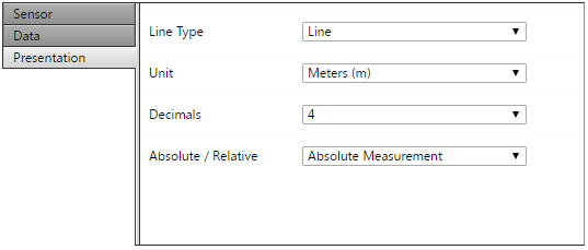
Select the presentation parameters:
-
Line Type: The plot type to use for the series; area, dots, lines, spline or area spline.
-
Unit: The measurement unit used to plot observations from the data value columns. Available options depend on the project's unit settings.
-
Decimal: The number of decimals to use when plotting observations from the data value columns.
-
-
Click Done to save the Analysis Series settings.
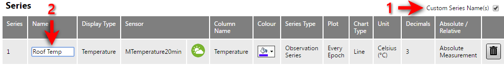
The created analysis series appears below the analysis settings:
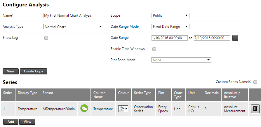
To set the plot color for the series, click the color selector. This option is available only for a single sensor; when multiple sensors are selected, T4D automatically assigns colors.
To remove the series, click the Delete button at the far right of the analysis series.
The name of an analysis series is by default the name of the sensor. To change this, select the Custom Series Name(s) option (1) at the top right of the Series table and then click the Name column of the listed analysis series. Enter the name in the text box (2). To apply the name to the analysis series, click anywhere outside the custom name text box.