Custom view settings
For each custom view you create, you can configure the following settings:
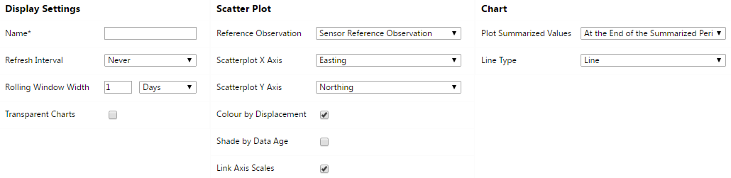
Display Settings
-
Refresh Interval:
Specify the interval by which data should be refreshed. (Same effect as with Maps that are refreshed.)
-
Rolling Window Width:
Specify the time window which will determine the date range used by custom view charts. The effective date range will change on a continuous basis.
-
Transparent Charts:
Transparency allows tooltips to be both visible and not obscure the custom view background image.
Scatter Plot
-
Reference Observation:
In Trimble 4D Control Web scatter plots always plot relative positions, which is the difference between an actual position and a reference position. You can either use the reference date of the selected sensor to obtain a reference position, use the first observation in the result set or use the average of the observation values within the result set.
-
Scatter plot X Axis:
Select the dimension to plot against the X axis of the scatter plot.
-
Scatter plot Y Axis:
Select the dimension to plot against the Y axis of the scatter plot.
-
Color by Displacement:
When this option is enabled, dots on the scatter plot will be colored green, yellow or red depending on the distance from the reference measurement. If this option is disabled, all dots will be blue.
-
Shade by Data Age:
When this option is enabled, a degree of transparency will be applied to each dot on the scatter plot. The latest observation will be solid and the oldest observation will be almost completely transparent. The use of this setting is only effective when you do not have multiple observations plotted on top of each other.
-
Link Axis Scales:
When this option is enabled, the two chart surfaces will be scaled identically. When this option is disabled, the scale of each chart surface will be optimized for the data that appears on that chart only.
Chart
-
Plot Summarized Values:
This option has an effect on the time value (or x axis value) against which summarized values will be plotted. Each node in a summarized series typically reflects the average observation value over a period (such as 1 hour or 1 day). By adjusting this option, you can plot summarized values either at the beginning, in the middle or at the end of the time period over which the data was summarized.
-
Line Type:
This option controls how the data will be represented on the chart surface.
