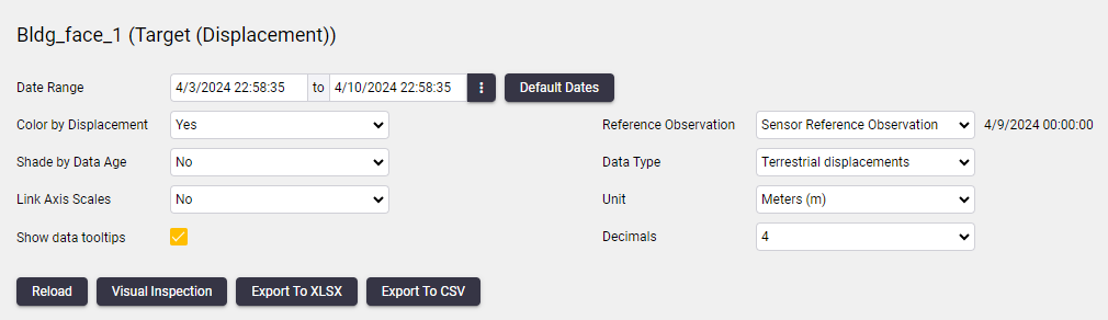
Scatter plot settings
Scatter plot settings are located below the two scatter charts.
The Scatter plot page and the Charts page have similar settings options (see Chart settings). This section reviews the settings options specific to scatter plots.
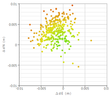
Color by Displacement
When Color by Displacement is enabled, dots on the scatter plot are colored on a gradient scale from green to yellow to red depending on the distance measured. This reflects the severity of the displacement. If Color by Displacement is disabled all the scatter plot dots will be blue.
Shade by Data Age
When enabled, a degree of transparency is applied to each dot. The latest observation will be solid and the oldest completely transparent. This setting is only effective if you do not have multiple observations plotted on top of each other.
Link Axis Scales
When the Link Axis Scales option is enabled, the two scatter charts will scale identically on the initial load of the scatter charts.
When the Link Axis Scales option is disabled, the scale of each scatter chart will be optimized for the data that appears on that scatter chart only. Please take note that the scatter chart scales will not remain identical if you zoom into an area on either scatter chart.
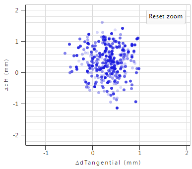
Show data tooltips
Use this checkbox to enable or disable the tooltips containing observation information. The tooltips appear as you move the mouse cursor over the plot points on the chart.
Reference Observations
Scatter plots always plots relative positions, this differs between actual and reference positions. You can either use reference dates of the selected sensor to obtain a reference position or use the first observation.
Data Type
If the selected sensor is linked to more than one positional data type, then the user will be able to select any of these data types from the drop-down.
Unit
Select the unit in which displacements are displayed on the scatter plot.
Decimals
Select the number of decimal places to be used to display displacements on the scatter plot.
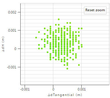
The number of decimals may affect the accuracy of the scatter plot. In the example above, the number of decimals is set to 4. All the displacements are grouped in intervals of 0.0001 (maximum 4 decimal accuracy) between the displacements 0 and 0.001.
