Chart settings
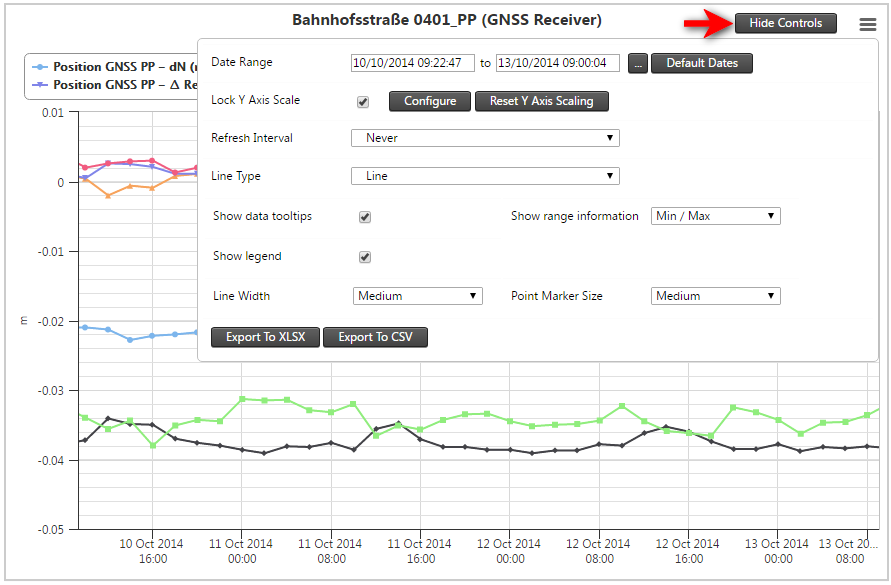
In the Chart screen, click the Show Controls button on the top right of the chart to show the Chart Settings. When the settings are shown, the label on the button on the top right of the chart changes to Hide Controls.

Lock Y axis scale
Use the Lock Y Axis Scale to calibrate the Y axis scale based on the current chart. When the Lock Y Axis Scale check box is selected the Y scale is remembered between zoom operations on the same sensor chart. When the check box is not selected the Y scale recalibrates with each zoom operation.
Configure Y axis scale
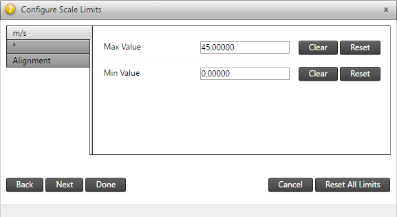
Click the Configure button to show the Configure Scale Limits dialog.
A tab is shown for each Y axis in your chart. You can specify Min and Max values for each Y axis. Once these values are set the Max and Min values are guaranteed to be shown on that Y axis.

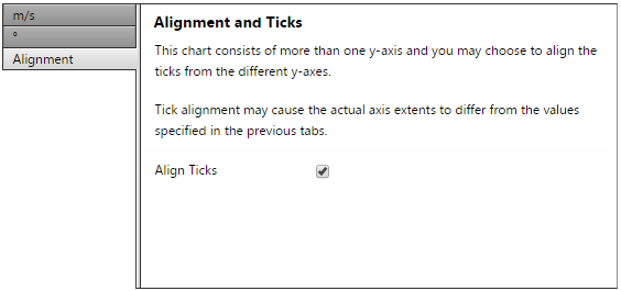
The Alignment tab enables you to align the tick marks of the different Y axes. If this option is enabled, the actual minimum and maximum Y-axis values may differ from the configured minimum and maximum Y axis values. This is because the charting may need to adjust the axes to ensure that the tick lines of the individual axes line up.
If you disable the Align Ticks option, then for aesthetic purposes the horizontal tick lines are not shown on the chart.

Date range
This setting adjusts the time frame of the chart displayed underneath. The default setting when loading a new sensor is data from the past week. If you want to change the time frame, click the [...] button which will present a pop-up with various settings. Inside this pop-up, the settings include:
-
Quick Selections: Today, yesterday, this week, last week, this month or last month).
-
Custom Selection: Set a custom time frame by clicking on the input fields. If you select a custom time frame, click the Reload button to activate the changes.
Click the Default Dates button to allow the chart to automatically select a date range, based on the most recent data available for the selected sensor. This action clears all stored zoom ranges and resets the zoom status to unzoomed.
Refresh interval
You can select an interval by which the data on the chart should be refreshed. This allows the system to periodically refresh the data displayed on the chart. In order to change the default refresh interval, click on the drop-down menu and select the required interval.
Line type
The options to view the chart either by area, dots, lines, spline or area spline.
Show data tooltips
The options to view the chart either by area, dots, lines, spline or area spline.
Show range information
Some series have more data values that are available although only the moving averages are plotted in the graph. If these additional data are available this option can be used to plot certain range related information to get an idea of spread of the data. The options available are the standard deviation (1 sigma), more deviations (2 and 3 sigma) or the absolute minimum and maximum extreme points.
Line width and pointer size
The Line Width and Pointer Size options modify the graph line and data point size to be displayed.