Alarm charts
See also Alarm history and alarm charts in Alarm configuration (optional settings).
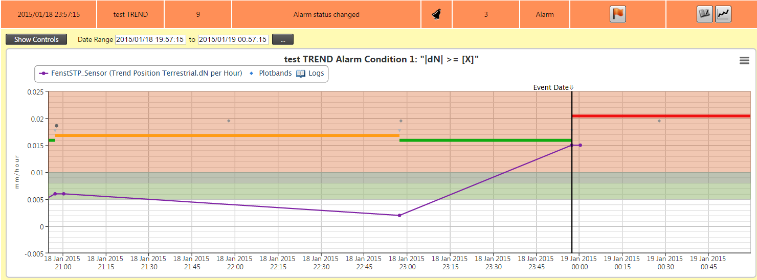
Alarm charts provide visual information about an alarm event and can assist in analyzing the cause of the event.

The purple line in the alarm chart above indicates the effective sensor readings.
The vertical black line indicates when the event has happened.
The horizontal lines (orange => green =>red) indicate the change in alarm states. Normally it should be all green (which is the OK state), but for this example we used very sensitive (low) thresholds to trigger the states.
The starting point of each line is where the event happened that triggered the state. Note that the red line starts from the vertical black line, which is the time where the event happened that we are inspecting.
The dots on the graph at the event changes indicate the first, second and final notifications that were sent out (depending on the configuration and/or escalations that happened). Move your mouse cursor over the points to display pop-ups containing more information.
The white area on the graph indicates the OK state for the effective sensor readings. The Attention, Warning and Alarm colored Plotband areas on the chart indicate where the particular alarm condition would evaluate to the appropriate Alarm State.