Analysis series plot band settings
To colorize the analysis chart background surface for a range of values, configure plot bands for the analysis.
For example, you can configure a Range for Y-axis values between 20°C and 30°C. Some analysis types also allow configuring Plot Bands in Zones for X-axis values.
-
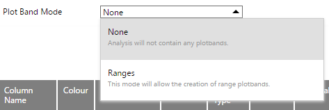
On the Analysis Settings page, change the Plot Band Mode setting to Ranges.

-
Click Save to apply the Plot Band Mode selection. The Plot Bands setting dialog appears.

-
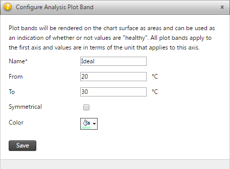
Click Add to open the Configure Analysis Plot Band dialog.

-
Enter the name for the Plot Band and specify the From and To values.
-
Select the Symmetrical option if you want another plot band symmetrical over the X-axis (for example, if the plot band is between 20°C and 30°C then the symmetrical plot band will be between -30°C and -20°C).
-
Click Save to apply the Plot Band values.
For an example plot band drawn on the analysis chart background surface, see the example chart in Analysis view.