Analysis view
To view the analysis, click the Analysis icon in the Analysis list on the left or click the View button .
This topic discusses the features specific to the normal chart analysis and some general Analysis features. For general information about the charting feature in Trimble T4D Control Web, refer to the Charts section.
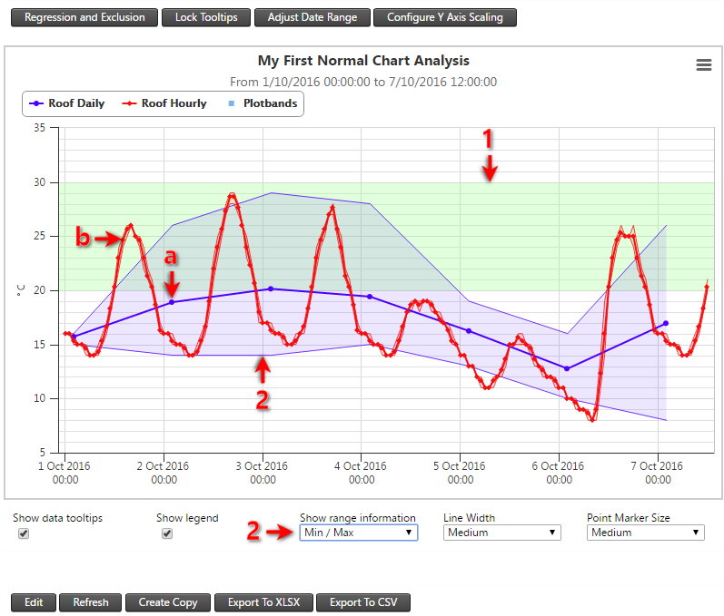
The analysis shown below has two Analysis Series, each from the same Sensor Data Value Column:
-
The raw sensor measurements are temperature readings every 20 minutes.
-
The Analysis Series (a) is configured to be a Value per Day summarized data set and the Analysis Series (b) is configured to be a Value per Hour summarized data set.
-
The same observations are therefore be shown in this analysis but from different summarized data sets.

In the Analysis View, the blue Analysis Series (a) and red Analysis Series (b) are plotted on the same graph.
-
Notice the plot band (1) on the chart background surface that we previously configured in the Analysis series plot band settings section.
-
The Show range information (2) is set as Min/Max by default. Available settings for Show range information are Disabled, Min/Max and various other standard deviation options.
-
Analysis Series (a) is plotted 2 hours after midnight on each day. This is because our example project has a timezone of UTC+2 and the Value per Day summarized is calculated per UTC day and also shown at the end of each UTC day.
