Charts
Use charts to visualize observations of sensors. Charts are useful to obtain a high level overview of the observations on a sensor and to drill down into specific observation time intervals for a closer inspection of the observations.
To view the Charts area, select Charts from the Charting and Analysis menu or click Charts in the Home page.
In the Charts area, all sensors in the project are automatically listed in the left sidebar navigation.

Filtering sensors
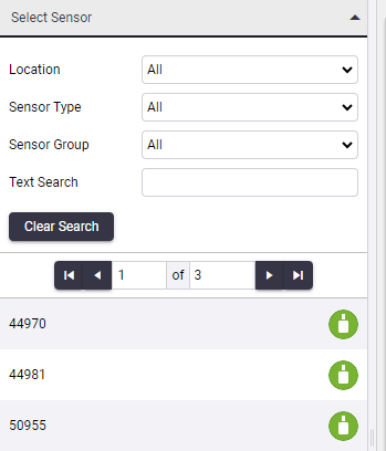
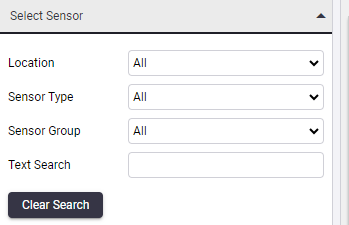
The sensors displayed on the left sidebar navigation can be filtered using the filtering options:

-
Location: Depending on the available list of sensors, this drop-down list is pre-populated with the locations of those sensors.
When you click in the drop-down list and select a location, the available sensors at the bottom of the section is refreshed.
When you select an entry in a drop-down field, the charts in the main content section do not change until you have selected a new sensor at the bottom of the sidebar navigation section.
-
Sensor Type: Select the sensor type to filter the map on the right hand side so that only the available sensors of the chosen type are displayed.
-
Sensor Group: The group you have allocated the sensor to belong to.
-
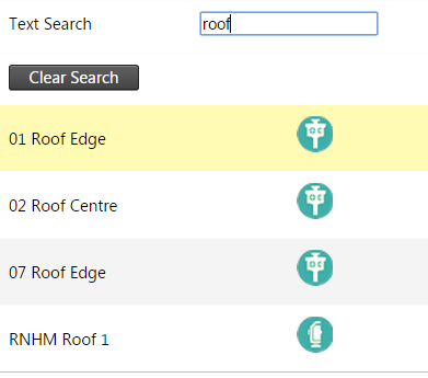
Text Search: Type the name or part of the name of the required sensor into the field provided and press Enter to perform a real-time search of the available sensors by that name.

Click one of the sensors in the sensors list to display the sensor data on the right. For more information, see Using charts.
Click the Clear Search button to clear all search fields and reset the page to display all sensors in the project.