Using charts
Once you have selected one of the sensors in the sensors list in the Charts area, the sensor data appears on the right.
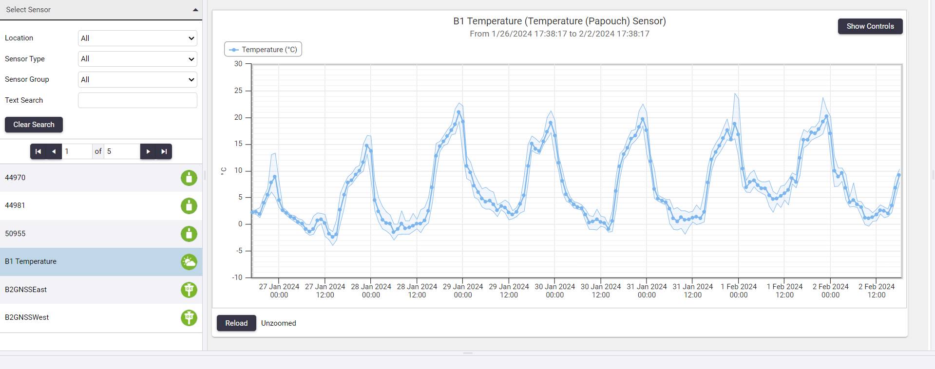
Clicking an item in the legend of the chart to show or hide that series in the chart.

Change the chart heading
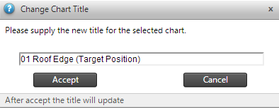
To change the chart heading, click the chart heading. In the pop-up window that appears, enter the new name for the chart and then click Accept.
Display chart point information
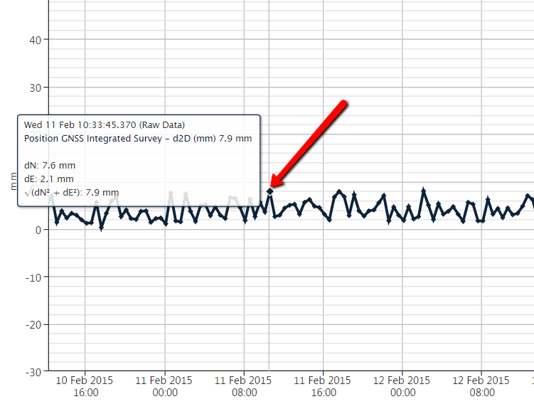
Hover the mouse cursor over the points of a chart series to display a tooltip containing the Chart Point Information.
Zoom into a chart section
Each chart series in the chart view displays either Raw Data or one of the Summarized Data Sets (per minute, per hour etc.), depending on the data density. This provides the best view on the data for the particular date range.
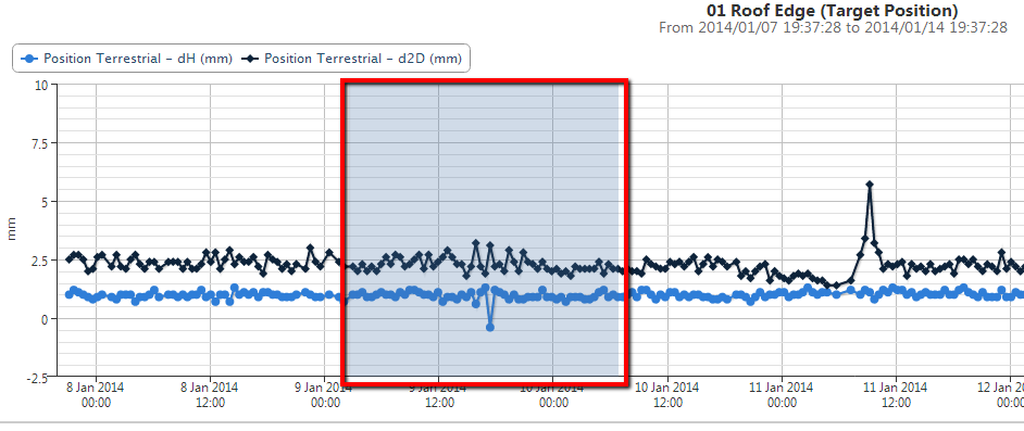
Zoom into a certain area on the chart by clicking on the chart and selecting the area which should be zoomed into (as indicated above). Once you release the left mouse button, the chat reloads to zoom into the selected area. Please note that the chart may load more data from the database.
The Zoom Status updates as you zoom in and out of the chart. The status may vary between unzoomed, zoomed and saturated. The Zoom Status is indicated on the bottom left of the chart next to the Reload button. The zoom status saturated occurs when the chart is zoomed in to such an extent that no additional data can be retrieved from the database. Usually this happens after you zoomed in repeatedly and when all series in the chart are already displaying Raw Data.
Attempts to zoom further while in a saturated Zoom Status, will lead to the chart being panned to the left or right without narrowing the date range.

To view a the previous zoom range, click Previous Zoom. To zoom out completely, click Reset Zoom.
The current Zoom Range as well as the stored Previous Zoom ranges are maintained when you select a different sensor.
If the chart series becomes horizontally too flat when you zoom in, then you can adjust the Y Axis Scaling (see Chart settings).
Freehand measurements
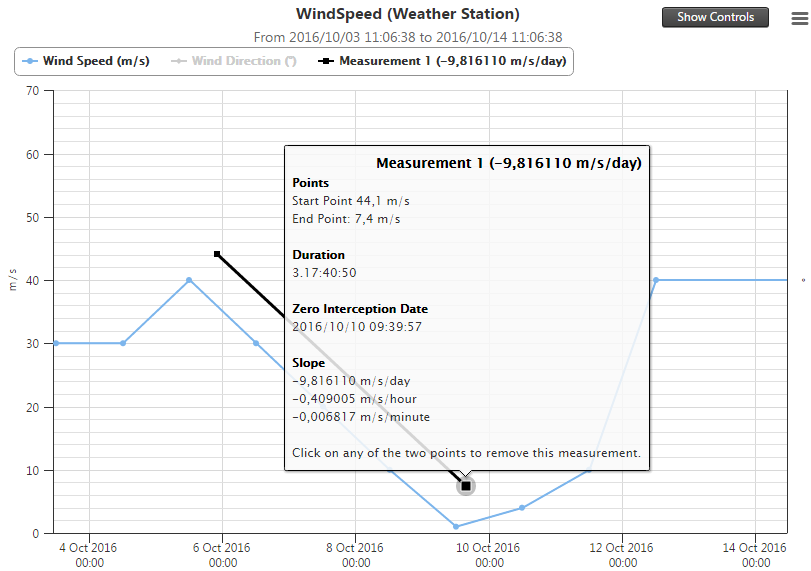
You can draw your own line to measure the slope between two points on the chart surface. To do this, hold down the Ctrl key and clicking on any position on the chart. Continue holding down the Ctrl key and move your mouse to another position on the chart and click on the second position to create the measurement line.
A line Measurement 1 with useful details appears as a new chart series.
When the chart contains more than one y-axis, then the freehand measurements are always done in terms of the primary y-axis (y-axis on the left).
